History: Sophomore Year

The Great Exhibition

Study of John Leech’s illustrations.

Punch was a British magazine of humour and satire founded by wood engraver Ebenezer Landells and writer Henry Mayhew, who got the idea for the magazine from a satirical French paper known as Le Charivari. It captured the impact of the rapid technological and social change for over 160 years. The first edition of Punch was published on July 17th, 1841.His social observations highlighted the plight of the poor and forgotten; or the daily humour of family life and leisure in Victorian England.

The term ‘cartoon’ was used to refer to drawings for the first time ever by Punch magazine in 1843 when Punch portrayed their cartoons publicly as murals, decorated on the Houses of Parliament. The word cartoon then, meant a finished sketch on any large piece of paper or cardboard. Punch humorously appropriated the term to refer to its political cartoons, and the popularity of the Punch cartoons led to the term’s widespread use as pictorial satire and ultimately any sort of humorous drawing.

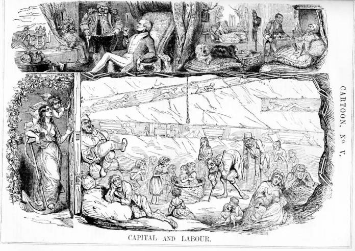
John Leech exposed terrible consequences of uncontrolled capitalism in his cartoons like Capital and Labour, and Cheap Clothing in which John Leech highlighted the growth of social and economic inequality in the Great Britain. Between 1842 and 1845 Leech produced a series of cartoons such as “Capital and Labour,” “Cheap Clothing,” and “The Agricultural Question,” all of which question the morality of the capitalist system.

Capital and Labout.jpg

John Leech criticised artists for ignoring social issues such as poverty. In “Capital and Labour,” he attacks the unthinking, selfish leisure classes for enjoying the warmth of their coal fires in England’s damp winter without giving a thought to the sufferings of the miners who made such fires and such ease possible for them. Shedding light upon the extremely dangerous working conditions in the factories (where children would customarily crawl under the machinery while it was running in order to clear away cotton threads), it directly led to the 1844 Factory Act.

Screen Shot 2016-10-06 at 7.09.43 pm.png

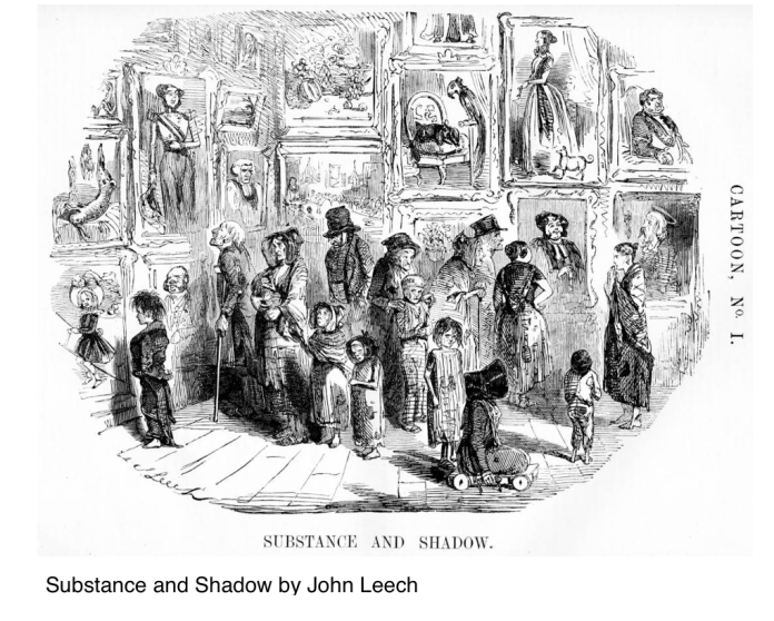
The above cartoon by John Leech- Substance and Shadow, focuses on the reactions of the male and female strays in the Parliament’s Picture-Gallery. Poor people in rags, many of them disabled, puzzled, looking at the picture-gallery in Westminster Hall opened by the government so that it could exhibit the “high society” cartoons, used as large sketched murals, with which it intended to decorate a hall in the reconstructed Parliament Buildings. The irony is that in reality the government competitors and the crowds had paid a shilling each to enter the gallery, where as the poor, of course, never had the opportunity to look-over these paintings since they could not possibly afford the price of admission to the hall. Half of the people attending the Westminster Hall Exhibition in Leech’s cartoon are street children. The artist’s main character is the urchin in the cast-off, oversized adult in the coat (left of centre) who is curiously examining a portrait of a high-born boy of about his own age on the wall — the “shadow” of the poor boy’s “substance.” While the urchin is barefoot, the dressy aristocrat rides a hobbyhorse; while the boy in the portrait wears a large hat, the street boy who anticipates Leech’s cartoon has only tangled hair.

The cartoon, aimed at the middle-class purchaser crowd of Punch magazine; leading the viewer of the illustration to see himself or herself as the viewer of the cartoons in the gallery, and therefore identifying himself or herself with the group of urban poor in the cartoon.

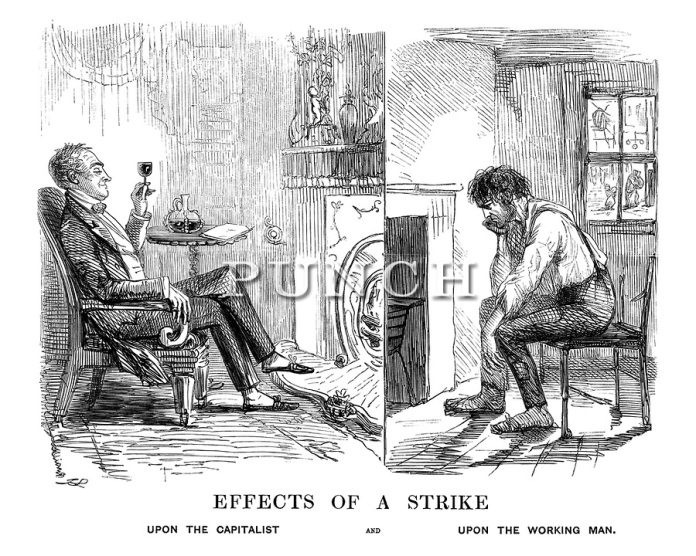
Effects of a strike.jpg

The above illustration by John Leech, called Effects of a Strike clearly throws light on the situation of a strike and the way it affects a capitalist, who enjoys the day without any worry and sounds time leisurely, where as the working man suffers as the earning the working men made every day was never sufficient enough for them to support their families well and hence even a single day’s pay makes a difference in their lives.

These are a few examples of John Leech’s work for Punch magazine, highlighting the the plight of the poor.

Standard
History: Sophomore Year

Critical Analysis: Grammar of Ornaments.

‘Form without colour is like a body without a soul’

Owen Jones was a resourceful architect and designer in the mid 19th century. In his design sourcebook ‘Grammar of Ornaments’, he has set out 37 propositions specific for designers to adhere to, to make their work meet with ends or functions supposedly served by the decorative object and to make them understand the commonly accepted standards of taste and beauty.

Proposition 21 which put forwards Owen Jones’ theory regarding the harmonious use of primary colour, states: In using the primary colours on moulded surfaces, we should place blue, which retires, on the concave surfaces; yellow, which advances, on the convex; and red, the intermediate colour, on the undersides; separating the colours by white on vertical plane.

Jones particularly admired the equal distribution of the surface ornament over the ground and the use of, the most brilliant colours perfectly harmonised. In this proposition, Owen Jones spoke about the positions that the colours should occupy on moulded surfaces, in order to have harmony in the colours and neutralise each colour used. In order to bring out the features and curves of the moulded surfaces,using yellow on the convex region, blue on the concave and red on the underside highlights the surface. It also continues to state that if Proposition 18, which talks about the proportions by which harmony in colour is produced,cannot be obtained, then the colours could be changed as per the designer’s interest, to procure the balance in the colours. For example, if the purpose is to make the surfaces give too much yellow, then we must make the red more crimson and the blue more purple, which means, to remove or lessen the yellow proportion in them.

Standard
History: Sophomore Year

A Timeline of Events That Boosted The Industrial Revolution

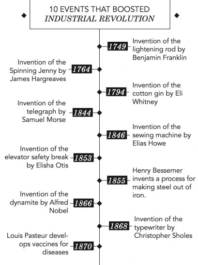
Industrial Revolution was a time period where important inventions took place that made work easier and cheaper. Prior to the Industrial Revolution, which began in Britain in the late 1700s, manufacturing was often done in people’s homes, using hand tools or basic machines. Industrialization marked a shift to powered, special-purpose machinery, factories and mass production. People moved away from the farms into cities, becoming a part of the rapid change in the world.

Some of the important inventions that took place to boost the Industrial Revolution are listed below:

timeline


  1. 1749: Invention of the lightening rod 

Benjamin Franklin spent the summer of 1749 conducting a series of groundbreaking experiments with electricity. There were other scientists who believed that lightning was electricity, but Franklin was determined to find a method of proving it.

Lightening rod is a pointed metalled attached to the roof of the building, which connects to a huge piece of copper or aluminium wire. If lightning strikes, the system attempts to carry the harmful electrical current away from the structure and safely to ground.

2.  1764: Invention of the Spinning Jenny

James Hargreaves, a British carpenter and weaver, invented the spinning jenny and hence revolutionised the process of cotton spinning. The machine spins more than one ball of yarn or thread at a time, making it easier and faster to make cloth. The machine used eight spindles onto which the thread was spun, so by turning a single wheel, the operator could now spin eight threads at once. This increased to eighty with improvements in the technology.

3.  1794: Invention of the Cotton Gin

U.S.-born inventor Eli Whitney patented the cotton gin, a machine that revolutionized the production of cotton by greatly speeding up the process of removing seeds from cotton fiber. It greatly reduced the time it took to clean cotton and helped the southern states make more money from cotton crops. By the mid-19th century, cotton had become America’s leading export.

4. 1844: Invention of the Telegraph

Samuel Morse invented the telegraph, which allowed messages to be sent quickly over a wire. By 1860, telegraph wires stretched from the east coast of the United States to the west of the Mississippi River. It worked by transmitting electrical signals over a wire laid between stations.

Although the telegraph had fallen out of widespread use by the start of the 21st century, replaced by the telephone, fax machine and internet, it laid the groundwork for the communications revolution that led to those later innovations.

5. 1846: Invention of the Sewing Machine

At a time when people had to make their own clothes at home or pay someone else to sew them by hand, Elias Howe invented the sewing machine that helped revolutionize garment manufacture in the factory and in the home

6. 1853: Invention of the Elevator Safety Break

Elevators were already invented by 1853, but people worried about elevator cars falling. Elisha Otis invented a safety break to prevent them from falling if a cable breaks, making people feel more confident about using elevators in tall buildings.

7. 1855: Invention of a process to make Steel out of Iron

Having a way to make steel more quickly and more cheaply helps the production of building and leads to the growth of cities. The mass-production of cheap steel only became possible after the introduction of the Bessemer process, named after its brilliant inventor, the British metallurgist Sir Henry Bessemer.  Bessemer reasoned that carbon in molten pig iron unites readily with oxygen, so a strong blast of air through molten pig iron should convert the pig iron into steel by reducing its carbon content.

8. 1866: Invention of Dynamite

Alfred Nobel invented dynamite, which is a safer way to blast holes in mountains or the ground than simply lighting black powder. Dynamite is important in clearing paths to build things such as roads and railroad tracks.

9. 1868: Invention of Typewriter

The evolution of the typewriter is part of the ongoing history of the human need to communicate. Gradually a machine emerged that revolutionized the work of the writer. In 1868, Christopher Sholes invented the first practical mechanical typewriter machine.The idea behind the typewriter was to apply the concept of movable type developed by Johann Gutenberg in the invention of the printing press century to a machine for individual use.

10. 1870: Invention of vaccines

A chemist named Louis Pasteur believed that germs caused disease. Using this information, he created vaccines that helped prevent many common diseases, which helped people live longer. Today, Pasteur plays the role of national hero in France, and the Pasteur Institutes he founded continue to develop breakthroughs in the prevention and treatment of infectious disease.


Bibliography

History.com Staff. “Cotton Gin and Eli Whitney.” History.com. 2010. Accessed September 07, 2016. http://www.history.com/topics/inventions/cotton-gin-and-eli-whitney.

“Industrial Revolution.” History.com. 2009. Accessed September 07, 2016. http://www.history.com/topics/industrial-revolution.

The British Library Board. “The Spinning Jenny.” The Spinning Jenny. Accessed September 07, 2016. http://www.bl.uk/learning/timeline/item107855.html.

HowStuffWorks. Accessed September 07, 2016. http://science.howstuffworks.com/nature/natural-disasters/lightning7.htm.

“Morse Code & the Telegraph.” History.com. 2009. Accessed September 07, 2016. http://www.history.com/topics/inventions/telegraph.

Spoerl, Professor Joseph S. “http://www.astm.org/JOURNALS/FORENSIC/PAGES/JFS2005103.htm.” Journal of Forensic Sciences J. Forensic Sci., 2005, 1. Accessed September 7, 2016. doi:10.1520/jfs2005110.

Ament, Phil. “Typewriter History – Invention of the Typewriter.” Typewriter History – Invention of the Typewriter. Accessed September 07, 2016. http://ideafinder.com/history/inventions/typrwriter.htm.

“Louis Pasteur.” History of Vaccines. Accessed September 07, 2016. http://www.historyofvaccines.org/content/timelines/pasteur.

Standard
Integrated Studio, Integrative Studio, Uncategorized

Part of a Whole

Blackletter according to me is the most adorned style of calligraphy. Though it is really confusing to read an entire sentence in this particular type, it visually stands out from all other existing type. This typeface was stop being used by all European countries by 1800 CE, after the French Revolution, because of its legibility issues, leaving Germany as the only country using Blackletter, but Germany too, officially declared Blackletter’s death by 1941 CE. It is now only being used in logos, headings, titles, etc and not in body texts or paragraphs.

The ‘Whole’ in my project being Blackletter typeface, I took its ‘legibility’ as the Part.

My take on this particular project, where we had to carefully examine a ‘whole’ and create a twist or modify its ‘part’ did seem challenging at first. The first slideshow shows the project’s process including the detailed study of blackletter typeface through practicing alphabets of every blackletter type enough to get it as close to its correct form.

The second slideshow shows the modifications made by me as the ‘twist’ part of the project. I then picked the most confusing alphabets from every type. For example the lower case Y of Fraktur which looks like a lower case H. I either eliminated, inverted or increased or decreased the height of different lines and forms of the alphabets.

This slideshow requires JavaScript.

This slideshow requires JavaScript.

Standard
Integrative Seminar, Uncategorized

Part of A Whole

Introduction

The following project is called ‘Part of a Whole’. The objective of the aforementioned project was to introduce us to design research skills. In this project, we are expected to explore and research on every minute detail of the ‘part’ chosen. Our research includes an in-depth study of the history and evolution of the part, materials used in the entire process of the making of the part, photo essay and our very own interpretation of the part. We also need to re-design our part by either modifying, adding variations to it or simply by adding a twist.

For this project, I have taken ‘Blackletter typeface’ as my whole, and its legibility as the part. I am looking at this typeface in detail, by carrying out the  research through the history of this typeface and its modifications through out its journey, its purpose and where it was used. After this, I will be making an attempt at modifying one of the blackletter types. this typeface was stop being used by the end of the 19th century

Problem statement: An attempt to modify few alphabets of blackletter to increase their legibility for the purpose of being used in body-texts again.

The evolution of Blackletter typeface

Blackletter was a beautiful part of typography and history. It’s dramatic thin and thick strokes make it stand out from the rest of the types, making it arguably the most adorned style of calligraphy. The disappearance of Blackletter is not in the script but in it’s history itself.

To understand the birth of this particular typeface, it’s important to look at it’s direct ancestor, Carolingian Minuscule. Carolingian Minuscule was evolved at the request of Emperor Charlemagne, the Kind of Franks, who himself was illiterate. He realised that a standard writing system would be beneficial for his kingdom’s growth and survival, hence to be used in his kingdom which included the whole of Western and Central Europe. This was the first script that required a clear difference between the capitals and the lower-case letter forms and also the first script to require a strong enough spacing. On the other hand, it was also necessary to conserve writing space because of the expensive writing surfaces like parchments. With the increasing demand of books and founding of new universities, it was difficult to produce the books in short time as Carolingian Minuscule was time consuming and labour-intensive to produce.

The more letters one could fit in a smaller space, the more economical it would be to produce a book. Hence the more words with blank ink and less white space gave rise to the term Blackletter.

Therefore, it can be said that Carolingian Minuscule actually formed the basis for the later development of blackletter.

There is a whole set of types of Blackletter, each having its own characteristics.

Starting from 1150 CE, Blackletter was used mostly in Western Europe till the 17th century AD, but continued in Germany till 1941 CE. Blackletter is also known as Fraktur, broken Type, german Script, Gothic Script and Old English. The angles formed in the line of this typeface is reference to the gothic architecture, a combination of broken arches and pointed arches in the cathedrals time.

The term ‘Gothic’ was first used to refer to blackletter in the 15th CE AD period in Italy, as the Renaissance Humanists mistakenly associated the script to goths and explained it to be barbaric.

Blackletter is often connected with germanys since it was used the longest there but it is not unique to just Germany, it has been used all over the western Europe.

Blackletter has five types namely- Textura, Rotunda, Bastarda, Schwabacher and Fraktur.

Textura was the first Blackletter type formed in 13th CE. It was based on the common change in architecture, that is to break up the round shape. All of the forms have been completely broken to diamond shaped serifs. Textura form is a narrow tightly set letters that was used in gothic churches, and its dark narrow beauty was used for spiritual charm. Textura was primarily used in France, England and Germany.

in 1455 CE, the first printed book in movable type was produced by Gutenberg known as the Gutenberg Bible with Textura as its type.

Rotunda was then developed after Textura in 14th CE. This typeface is less angular, broken forms are indicated but not completely executed, they are loosely placed and have increased legibility to read. This rounder style was more popular during the Renaissance in Italy, Southern France and Spain.

Bastarda then was formed in 1470 AD, which looked liked a mixture of Textura and Rotunda.

Schwabacher, which was formed after Bastarda, was a standard printed typeface in Germany reformation and farmers repellence hence it was the most modest in all scripts lower case forms and relatively wide and have round shapes. Schwabacher is a style of Bastarda that has been traditionally used in Germany.

By the end of the 15th CE, most of the Latin books in Germany were printed in dark, barely legible gothic style, Textura, where as the German books used the rougher type Schwabacher.

Based on Bastarda, Fraktur in 16th CE. was evolved. It was created by calligrapher Leonhard Wagner. Fraktur literally means fracture, that is broken, which is clearly indicated in the type. It’s fine delicate letter forms and aesthetic charm is the reason why it is the most common Blackletter type. Emperor Maximilian decided to establish a magnificent library of printed books, and he directed that a new typeface should be invented for this purpose that needed to be more elegant than Schwabacher, more modern than Textura, still looking “German” enough and mainly, legible enough for the common people to read.

On the other hand, there was a constant battle of typefaces between Blackletter and Antiqua from 1500 AD to 1941 AD

Even though Blackletter was commonly used through out Western Europe, the humanistic Antiqua typeface was the opposite of blackletter script. It was more legible to read, which is why it very soon came in the favour of Italy, France and other capital regions. Little by little the common use of Blackletter script died out in Europe and after the French Revolution (1799). Blackletter had great history but Antiqua had increased reading legibility all over Europe.

However, Fraktur was still used in Germany as the national script. In 1911 AD, there was a very close vote in the German Parliament between Blackletter and Antiqua, where Blackletter won by a difference of just three votes.

Fraktur glorified as the only true German typeface, but the official death of Fraktur in 1941 AD proclaimed that it was a typeface of the Jewish. It was a lie with intention, as Fraktur was not a practical typeface for a country like Germany that intended to obtain world power when the other parts of the world did not use it.

Based on its rich graphic nature, letter forms are do different from every other serif and sans serif typefaces. Designers and printers are trying to carefully pull back these treasures back to life, free from political, religious or other presidential sentiments.

Bibliography

“Retinart.” Retinart. Accessed May 22, 2016. http://retinart.net/typography/blackletter/.

“The Library of the Gutenberg Museum — I Love Typography.” I Love Typography RSS. 2010. Accessed May 31, 2016. http://ilovetypography.com/2010/03/01/the-library-of-the-gutenberg-museum/.

“History of Fraktur Writing and Printing in Germany at the Walden Font Co.” History of Fraktur Writing and Printing in Germany at the Walden Font Co. Accessed May 31, 2016. https://www.waldenfont.com/content.asp?contentpageID=5.

“The Story of Blackletter- Animation.” YouTube. 2012. Accessed May 31, 2016. https://www.youtube.com/watch?v=lQcO4n-RiOk.

Material Exploration

During the seven weeks of this project, I have practiced the art of hand lettering through blackletter typeface. During the process I noticed that the letters of this typeface were more angular and closer together and the pen strokes thicker.

I used devanagari dip-pens and pilot parallel pen to get the angles, the thickness and thinness, the sharpness and roundness of the letters right. For ink, I used black drawing ink and transparent photo colour in stone grey colour. The drawing ink was thicker to use which also gave a nice even black appearance for the letters, but the photo colour was smoother to use. To get the letters precisely, I initially printed all the alphabets in the four given blackletter type, that is Textura, Schwabacher, Rotunda and Fraktur, and traced it printing paper. After practicing a letter at least five to six times using the tracing method, I was able to write the letter on my own.
Standard
Uncategorized

Film review: Eternal sunshine of a spotless mind

Film Review: Eternal sunshine of a spotless mind

A complicated story which demands the viewer’s complete attention, the aforementioned movie revolves around Joel, a man stuck with a repetitive life until he meets the spontaneous, care-free Clementine. Their relationship soon takes an ugly turn, which is when Clementine decides to completely remove Joel from her memory, and to take revenge Joel decides to remove her from his memory as well. But the funny part here is, that we tend to remember more of the good memories than the bad ones. Joel, in mid-process decides to keep Clementine’s memory after all. He tries to save some of her memories hidden in the corners but the process was adamant. 

During the course of the film, which moves dizzyingly, forward and backward in time shows different aspects of their relationship. The movie shows the constant need of love, attention and companionship that human keeps seeking. 

Standard